



From Printed Grain to a Textured Decorative Panel
The character of a wood-look panel comes from the relationship between colour, printed grain and physical texture. Follow the paper-and-press process, then see why a larger sample can change the way you select a finish.
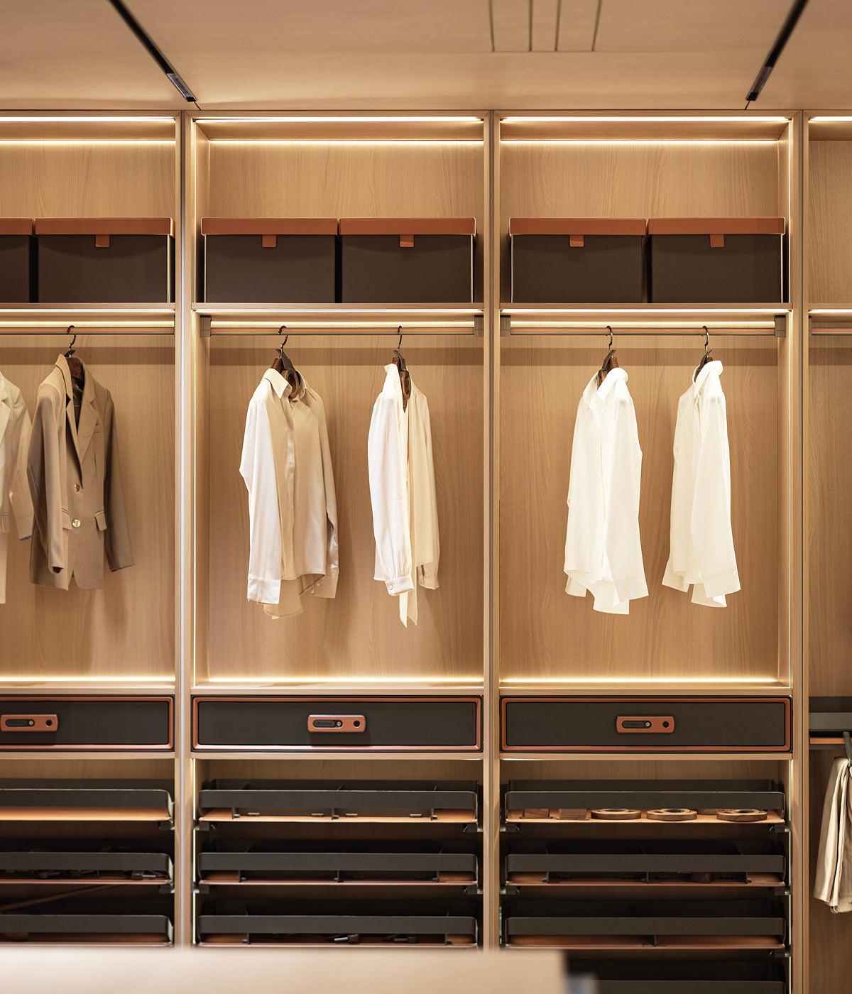
Begin with colour and timber character
A convincing timber-inspired surface needs more than a recognisable grain. Light and dark tones give the pattern depth; subtle transitions help it read naturally. Pores and fine relief change the highlights as you move past the surface.
Verdécor’s woodgrain direction brings those observations into a practical melamine panel. The resulting surface is a decorative reproduction, so assess the selected pattern and texture as a finished panel rather than assuming the material is timber veneer.
The choice begins with the effect you want: a quieter grain for repeated cabinetry, a more expressive pattern for a broad elevation, or a tactile finish for a frequently handled door.
The paper carries the printed image
Decorative paper provides the colour and grain. Up to four gravure colour layers can be used, depending on the décor. Those layers contribute to the pattern’s tonal relationships; the exact approach varies with the selected design.
Melamine resin then saturates the decorative paper. Heat and pressure bond the face to its core and transfer the steel plate’s surface character. The paper and plate have related but distinct roles: one carries the image, while the other contributes relief and gloss.
- Develop the decorative image and its colour layers.
- Impregnate the decorative paper with melamine resin.
- Press the face onto the selected core.
- Transfer the plate texture during pressing.
Two ways to relate grain and relief
ExactSync uses décor-specific alignment between the printed grain and embossed relief. It brings the visible grain and the tactile pattern into a coordinated relationship. Chestnut Oak 4024, for example, uses a dedicated matching plate.
NaturalGrain Plus uses a texture selected for timber character. It is a different design approach, rather than a promise that every pore follows the printed image. Aspen Walnut 4040 is shown as a selected timber-texture example.
Read the exact décor and texture label. A surface can be visibly textured without being ExactSync, and the current sample version matters when a design changes.
Read the pattern at the scale of the room
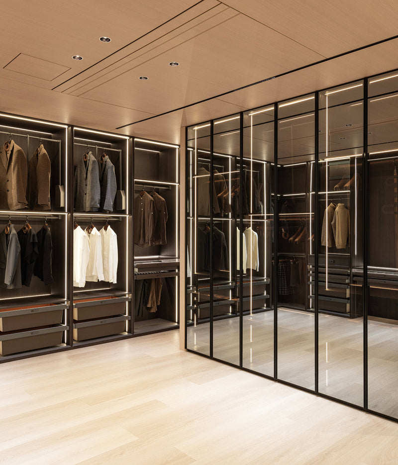
A small chip can help with colour, but may leave out the full grain movement. Compare a larger view against the intended door, wall or wardrobe elevation. Check grain direction, pattern scale and how adjacent cut pieces will be arranged.
Place the sample beside neighbouring finishes under consistent light. Compare reflection, colour depth and relief at similar angles, then record the chosen collection, décor code and sample reference. The fabricator can use that record alongside the cut plan and product specification.
Explore the WoodGrain texture approaches or consider WoodGrain 2070 for larger compositions. The texture choice and sheet-format choice answer different parts of the design brief.
Leave a comment
This site is protected by hCaptcha and the hCaptcha Privacy Policy and Terms of Service apply.